

Form fields
You add and set up fields in the Build step of a form. The left panel has two tabs: Field Library, where you pick fields, and Edit Field, where you change the selected field.
Add, arrange and remove fields
Section titled “Add, arrange and remove fields”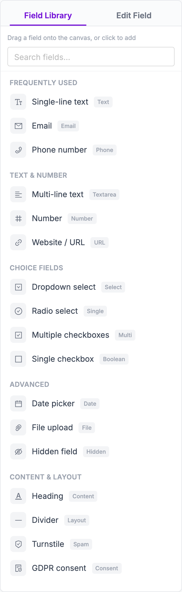
- Add a field: in Field Library, click a field to add it at the end of the form, or drag it to the place you want on the canvas. Type in Search fields… to find one.
- Edit a field: click it on the canvas. The Edit Field tab opens with its settings.
- Reorder: drag a field by its handle on the canvas.
- Remove: click the delete icon on the field.
- Check your work: switch from Edit to Preview above the canvas to see the form as visitors will. Use the desktop and mobile icons to check both sizes.
Changes are saved as a draft as you go. Visitors only see them after you publish.
Field types
Section titled “Field types”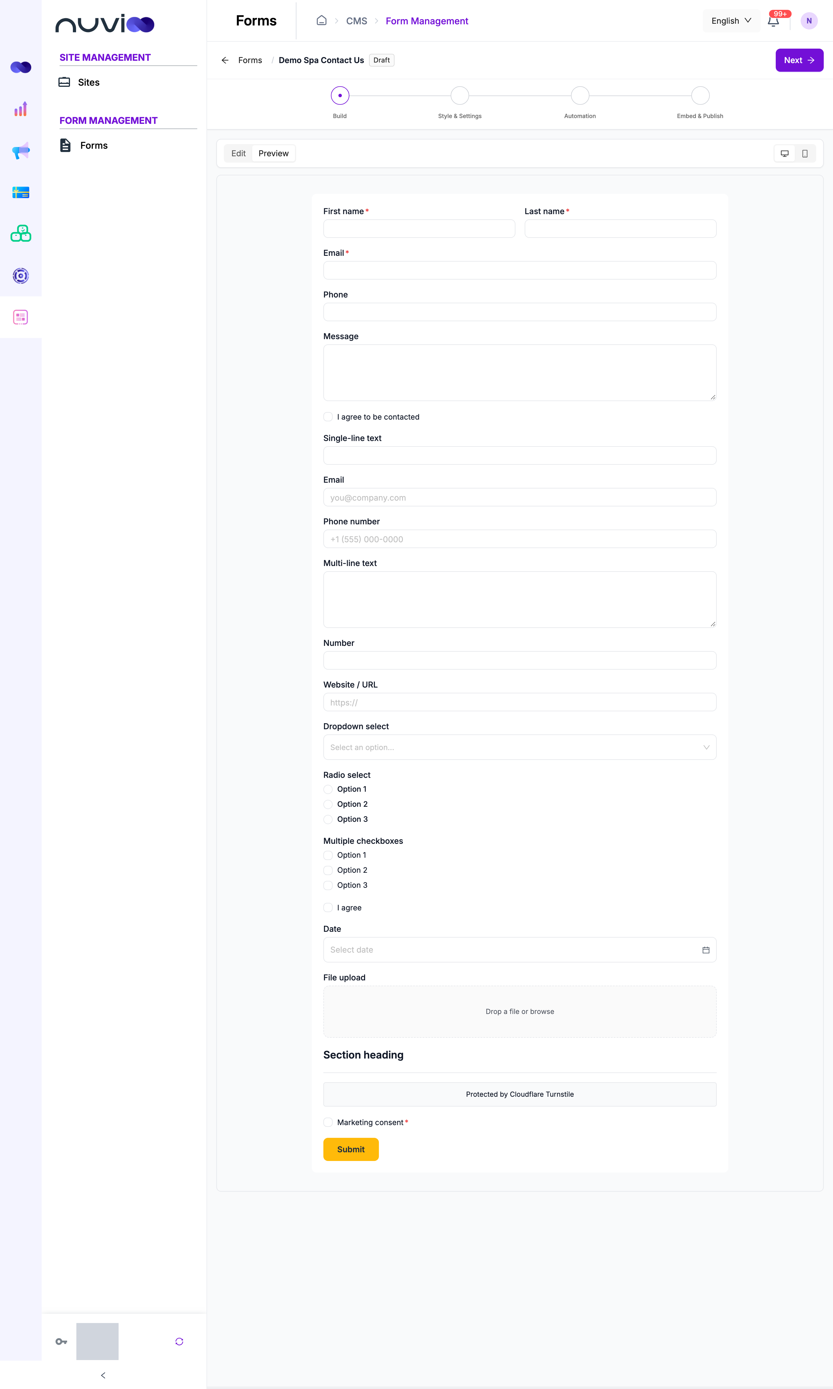
Frequently used
Section titled “Frequently used”| Field | Use it for | Notes |
|---|---|---|
| Single-line text | Short answers: name, company, job title | Set a minimum and maximum length. A label containing “first”, “last” or “job” is mapped to that contact property automatically. |
| The visitor’s email address | Checks the address format. Mapped to the contact’s Email. | |
| Phone number | A phone number | Mapped to the contact’s Phone number. |
Text & number
Section titled “Text & number”| Field | Use it for | Notes |
|---|---|---|
| Multi-line text | Messages, questions, comments | Set a minimum and maximum length. Mapped to the contact’s Note. |
| Number | Quantities, budgets, party size | Set a Min value and Max value. |
| Website / URL | A website address | Checks the address format. |
Choice fields
Section titled “Choice fields”| Field | Use it for | Notes |
|---|---|---|
| Dropdown select | One choice from a long list | Edit the choices under Options. |
| Radio select | One choice from a short list, all visible | Edit the choices, and lay them out Vertical, Horizontal or in Columns. |
| Multiple checkboxes | Any number of choices | Same as Radio select, but visitors can tick several. |
| Single checkbox | One yes/no question, for example “I agree to the terms” | Turn on Required field to make visitors tick it. |
Advanced
Section titled “Advanced”| Field | Use it for | Notes |
|---|---|---|
| Date picker | Preferred dates, birthdays, event dates | Limit the range with Earliest date and Latest date. |
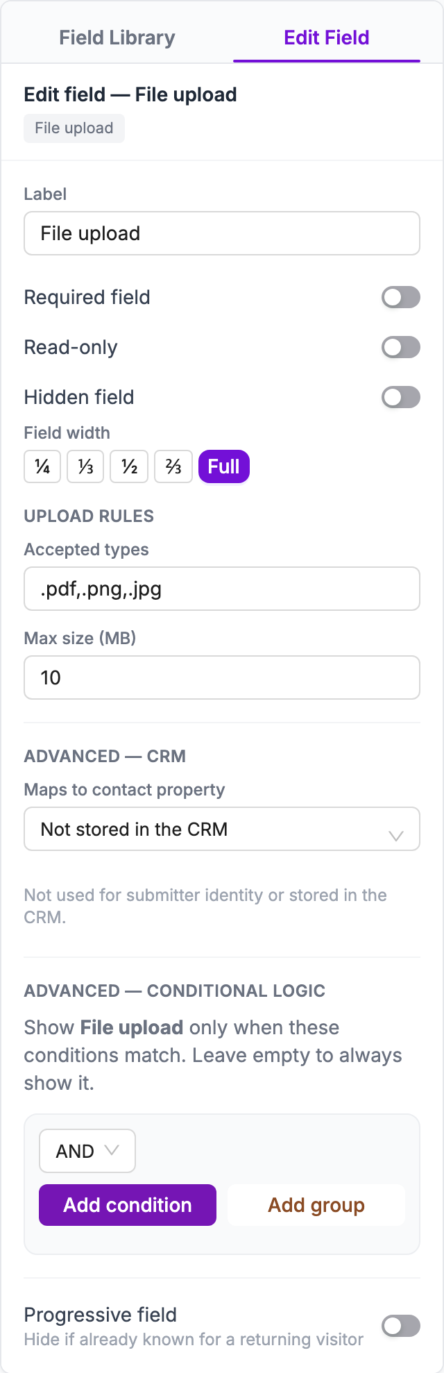
| File upload | Résumés, photos, documents | Set Accepted types and Max size (MB). The default is PDF, PNG and JPG up to 10 MB. |
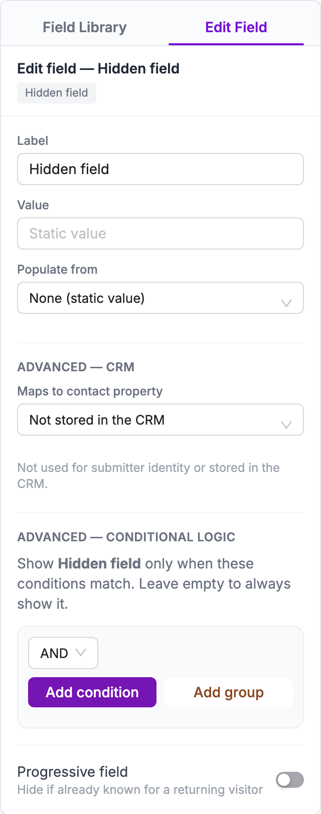
| Hidden field | Data visitors don’t see, such as the campaign they came from | Fill it with a fixed value or from the page. See Hidden fields. |
Content & layout
Section titled “Content & layout”| Field | Use it for | Notes |
|---|---|---|
| Heading | A title that splits a long form into sections | Doesn’t collect data. |
| Divider | A line between sections | Doesn’t collect data. |
| Turnstile | Blocking bots with Cloudflare Turnstile | Shows “Protected by Cloudflare Turnstile”. Also turn on Cloudflare Turnstile in Data & spam. |
| GDPR consent | Asking for permission to send marketing | A required checkbox with your consent text, for example “I agree to receive marketing communications”. The answer is saved with the submission, and the Send email automation can use it. |
Field settings
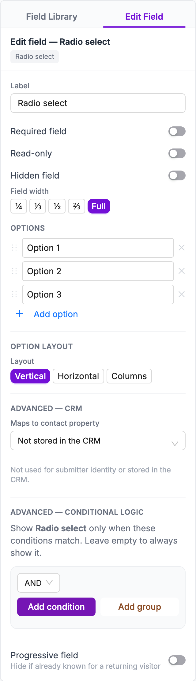
Section titled “Field settings”Click a field on the canvas to open Edit Field. The settings depend on the field type.
Settings on most fields
Section titled “Settings on most fields”| Setting | What it does |
|---|---|
| Label | The question visitors see. Every field needs a label. |
| Placeholder | Grey example text inside an empty box (text-like fields). |
| Help text | A hint shown under the field. |
| Default value | Text the field starts with. Visitors can change it. |
| Required field | Visitors can’t submit without filling it in. A red asterisk shows next to the label. |
| Read-only | Visitors see the value but can’t change it. Use it with Default value. |
| Hidden field | Hides the field from visitors but still sends its value. |
| Field width | ¼, ⅓, ½, ⅔ or Full of the form’s width. Put two ½ fields side by side, for example First name and Last name. |
Settings for some field types
Section titled “Settings for some field types”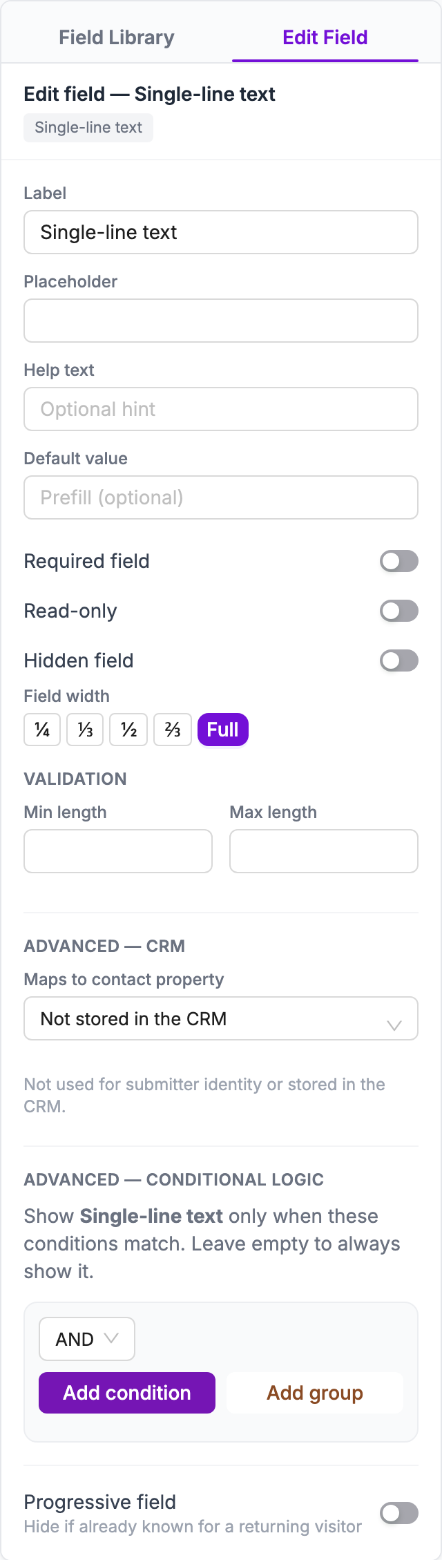
- Validation (Single-line text, Multi-line text): Min length and Max length in characters.
- Validation (Number): Min value and Max value.
- Validation (Date picker): Earliest date and Latest date.
- Options (Dropdown select, Radio select, Multiple checkboxes): type each choice, click Add option for more, drag to reorder and click × to remove. Each choice needs a label, and no two choices can be the same.
- Option layout (Radio select, Multiple checkboxes): Vertical, Horizontal or Columns. With Columns, choose the Number of columns (2, 3 or 4) and the Column flow: Across fills rows first, Down fills columns first.
- Upload rules (File upload): Accepted types, such as
.pdf,.png,.jpg, and Max size (MB). - Heading text (Heading): the title to show.
Hidden fields
Section titled “Hidden fields”A Hidden field sends a value with every submission without showing it to visitors. Use it to record where submissions come from.
- Populate from: where the value comes from. Choose UTM source, UTM medium, UTM campaign, UTM term, UTM content, Page URL or Referrer to read it from the page. Choose None (static value) to always send the same value.
- Value: the fixed value, when Populate from is None (static value).
Save answers to the CRM
Section titled “Save answers to the CRM”Under Advanced — CRM, Maps to contact property decides which contact property a field fills when the form creates or updates a contact. Choose First name, Last name, Email, Phone number, Job title or Note. Choose Not stored in the CRM to keep the answer only on the submission.
New fields are mapped automatically where it’s clear. For example, Email maps to Email, Phone number to Phone number, and a text field labelled “First name” to First name. Check the mapping before you publish.
Conditional logic
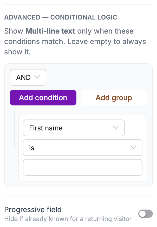
Section titled “Conditional logic”Under Advanced — Conditional logic, you can show a field only when earlier answers match. For example, show “Which service?” only when “Reason for contact” is “Booking”.
- Click the field to show or hide, and scroll to Advanced — Conditional logic.
- Click Add condition. Choose a field, a comparison and a value.
- Add more conditions if needed. Choose AND to require all of them, or OR to require any one. Use Add group to combine both.
Comparisons: is, is not, contains, doesn’t contain, less than, greater than, at most, at least, is empty and is not empty. Leave the conditions empty to always show the field.
Submit button
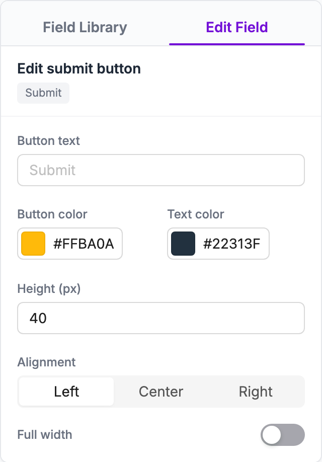
Section titled “Submit button”Click Submit at the bottom of the canvas to open Edit submit button.
| Setting | What it does |
|---|---|
| Button text | The label, for example “Send” or “Book now”. |
| Button color and Text color | The button’s colors. |
| Height (px) | The button height. |
| Alignment | Left, Center or Right. |
| Full width | Stretches the button across the form. |
Before you continue
Section titled “Before you continue”Click Next to go to Style & Settings. If something on this step needs fixing, Complete this step tells you what. For example:
- Every field must have a label.
- A choice field needs choices with a label, and no two choices can be the same.
- A field’s minimum can’t be greater than its maximum.
- The fields that identify the contact must be mapped and required (see Save answers to the CRM).